
How to build monthly reports in SEO Gets
Building monthly reports in SEO Gets is simple. All you have to do is configure a property dashboard the way you want it and share that view. This approach gives stakeholders an interactive, real-time snapshot they can explore on their own—no spreadsheets or static PDFs required.
Set your monthly date range
Start by narrowing your data to the month you're reporting on.
Open the property you want to report on from your master dashboard.
Click the date range dropdown at the top of the dashboard.
Choose Last Month for a complete month of data, or select This Month for month-to-date results.
For monthly reporting, Last Month is usually your best starting point—it gives you a complete, comparable period each time.
How the date picker works
The date range selector might look simple, but there's a bit more going on under the hood. Here's what you should know:
Last Month and This Month presets
Last Month always gives you the complete previous calendar month—from the 1st through the last day of that month. So if you're looking at the dashboard on May 15th, Last Month pulls April 1–30. This keeps your monthly reports consistent and comparable over time.
This Month shows month-to-date data—from the 1st of the current month through today.
Custom date ranges
Need a specific window? Choose Custom from the dropdown, then enter your start and end dates manually. The picker has minimum and maximum date limits, so you can't select dates outside your available data range.
Why the view might change unexpectedly
A few things in the date selector can shift what you're seeing:
Comparison period — If you've enabled a comparison (like Previous Period or Year Over Year), the chart shows both your selected range and the comparison range. Switching comparison modes can make the chart look different even though your main date range hasn't changed.
Interval — If you notice the data selector changing your start date from the one you've selected, check your interval to see whether it's set to day, week, or month. Depending on what you've selected, it may impact your date range.
Search type — Web, Discover, News, Image, and Video search types are set inside the date range selector, not the main filter bar. Changing search type here affects what data appears in your charts.
URL persistence — Your date selections stay in the URL as you navigate. If you share or bookmark a URL, those date settings travel with it.
If your chart looks off after switching date ranges, check whether a comparison period is active or if the search type changed—those are the most common reasons.
Select your metrics
Toggle the metrics you want to highlight in your report using the metric icons at the top of the dashboard. You can select any of the GSC or GA4 metrics depending on what you're reporting on. However, you are limited to a selection of four metrics at a time, which limits visual clutter and keeps reports focused on the performance your stakeholders care about.
Apply filters to focus the story
Filters help you surface specific insights. Click the Filter button to narrow your data by:
Query — Focus on specific keywords or keyword patterns
Page — Report on a particular section or URL
Country — Show performance in key markets
Device — Compare mobile vs. desktop traffic
Branded/Non-branded — Separate brand awareness from organic discovery
You can also use Saved Filters or Preset Filters (i.e. People Also Ask, Long Tail Keywords). If you want to adjust Search type to filter by web, discover, news, image, or video results, you can adjust your preference in the date range selector.
Make sure you've set up your branded keywords in Settings so the branded/non-branded filter works correctly.
Use report-style views
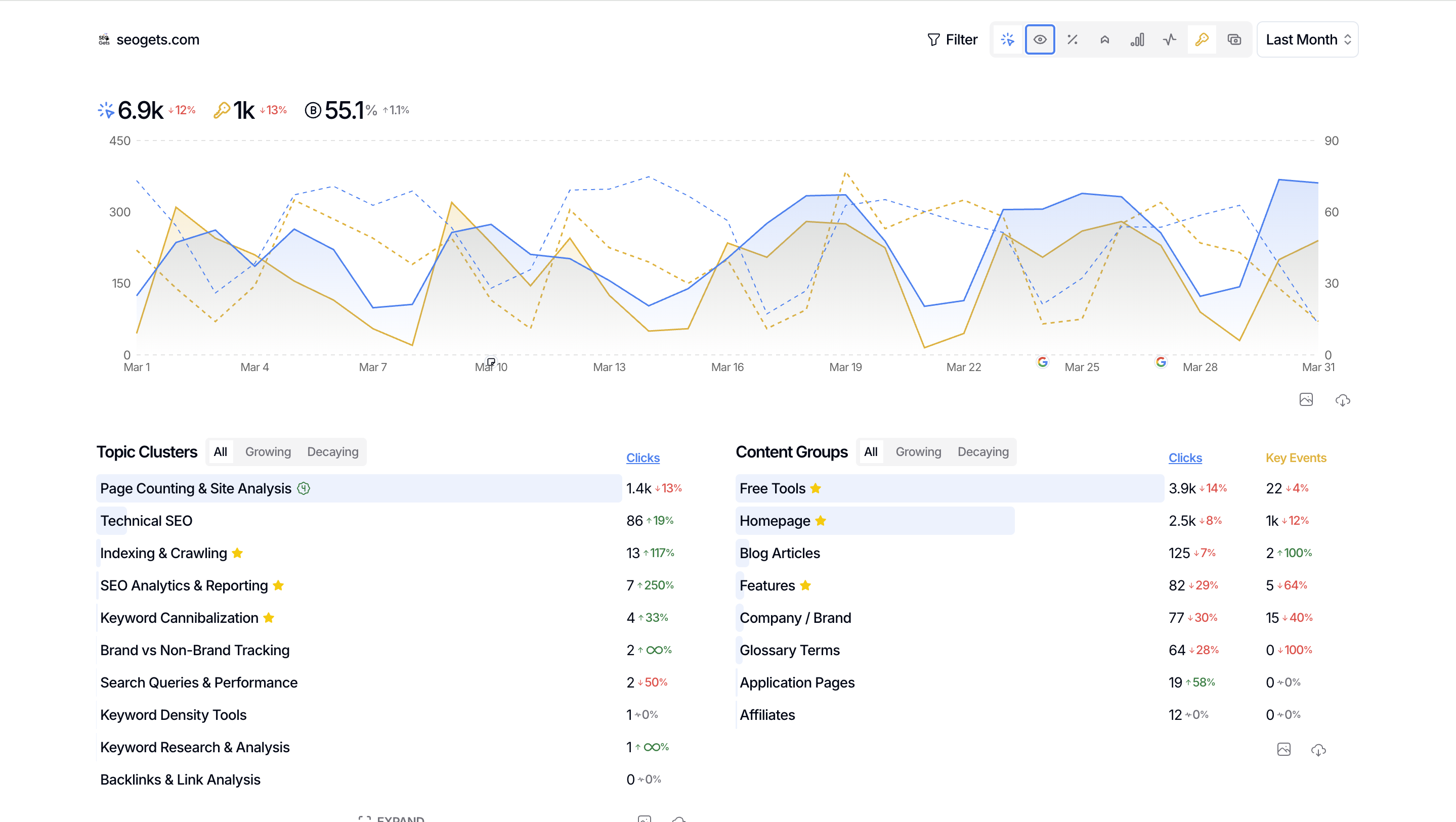
Once your date range, metrics, and filters are set, use the built-in views to tell a complete story. These are all available directly in your property dashboard:
Topic clusters — Group keywords by theme and show how your topical authority is growing
Content groups — Report on sections of your site (like your blog, product pages, or location pages)
New rankings — Highlight keywords that newly appeared in search results this month
Branded vs non-branded clicks — Show the balance between direct brand searches and organic discovery
Countries — Break down performance by geographic region
Each of these views can be filtered further, so you can customize what appears for each stakeholder.
Share your report


When your dashboard is configured the way you want, share it with stakeholders with a Shared Link:
Click Settings for the property you've configured.
Scroll down to Shared Link.
Click Generate Link if it's your first time, or Regenerate Link if you've updated the dashboard since last sharing.
Copy the link and send it to your stakeholder.
Whoever opens the link sees the exact dashboard view you configured—same date range, same filters, same metrics. They can interact with the data but can't access your other sites or account settings.
What's next
Add annotations to track what work happened during the month so stakeholders understand what drove the changes they see. Annotations are visible in performance graphs.
Set up recurring monthly reminders to regenerate your shared link after updating your dashboard.