
Why chart exports show different date comparisons than the dashboard
For acomplete overview of all export mismatches—including CSV exports, date picker limits, and GSC/GA4 differences—see Why your export counts might not match the dashboard.
If you experience a situation where your dashboard charts and your exported chart don't match, it likely means that the comparison period doesn't match. SEO Gets chart export feature defaults to period-over-period comparisons.
For example, if you're using a Year Over Year (YOY) comparison in your dashboard but the exported chart image shows different data, it's because the chart export is measuring against the previous period. This means the export compares the same number of days, but not the exact same dates from a year ago.
What this looks like in practice
Let's say you're viewing January 12 through April 30 with YOY comparison enabled. Your dashboard compares that range to the same dates last year. But when you export the chart as an image, the export uses Previous Period instead—so it compares January 12 through April 30 to an earlier window of the same length, like October through January, not last year's matching dates.
The result? Your export looks different from what you see on screen because the comparison period shifted.
Why this happens
PNG exports currently don't carry over YOY comparison settings from the dashboard. They default to Previous Period, which is a rolling backward comparison rather than a same-dates-last-year comparison. This is because the chart export feature is designed to surface quick wins and communicate growth from one period to the next.
If you need the export to match your YOY view exactly, take a screenshot of the dashboard instead. This preserves the comparison mode you have active.
How to get the comparison you want
Here are your options:
Use a screenshot: Capture the dashboard directly. This keeps whatever comparison mode you have selected, including YOY.
Adjust for Previous Period: If you're okay with Previous Period comparison in the export, just be aware it won't match your on-screen YOY view.
Check before adding annotations: If you're adding annotations after exporting, verify the date range still reflects what you intend. The export's comparison shift doesn't change your dashboard settings, but it can cause confusion if you're referencing the exported image while annotating.
Annotations and date context
Adding an annotation within your selected date range can change your data as well. The earliest annotation within your selected date range will modify the start/stop point for your exported chart's data. Additional annotations help tell the story of what happened between those two dates.
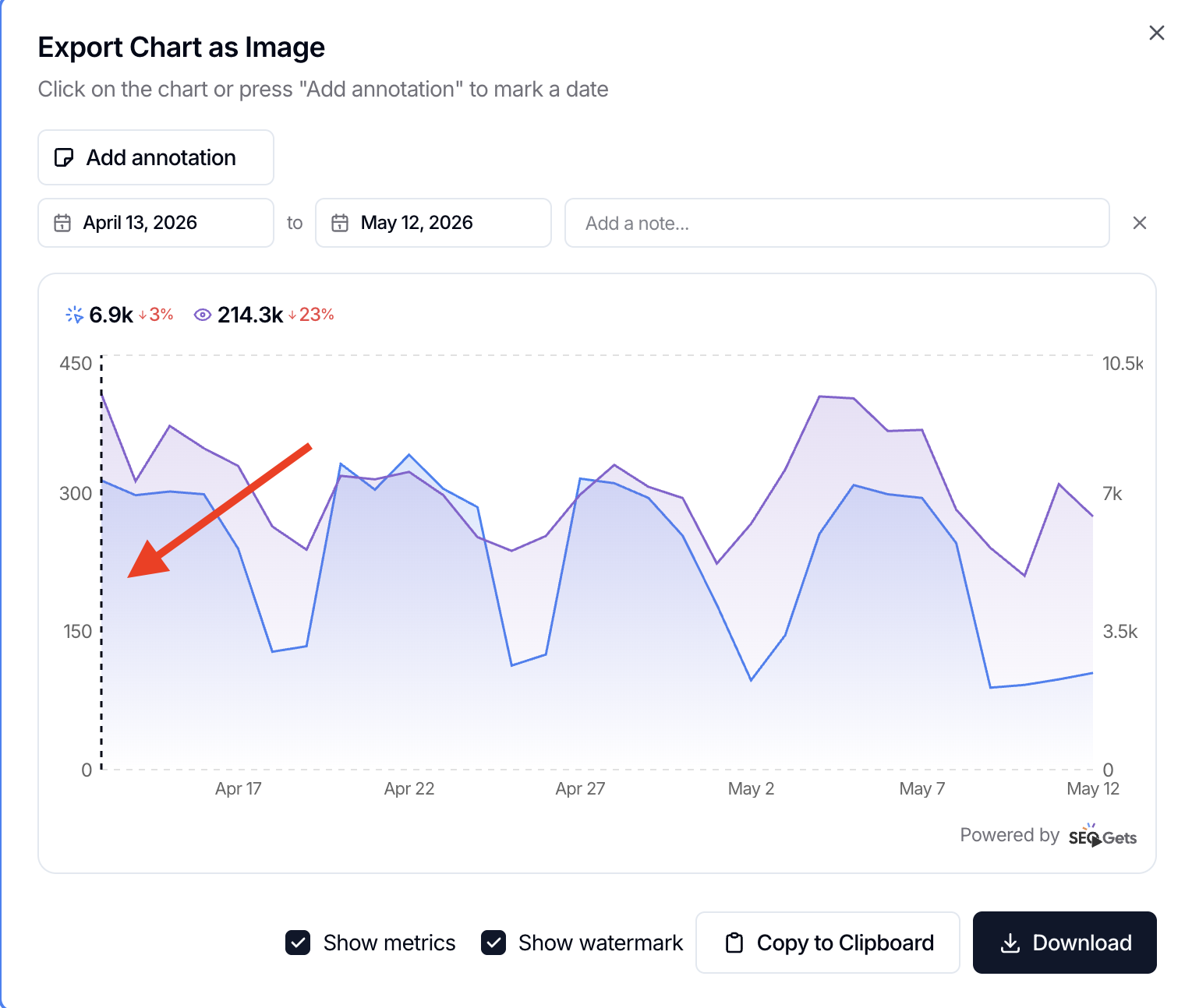
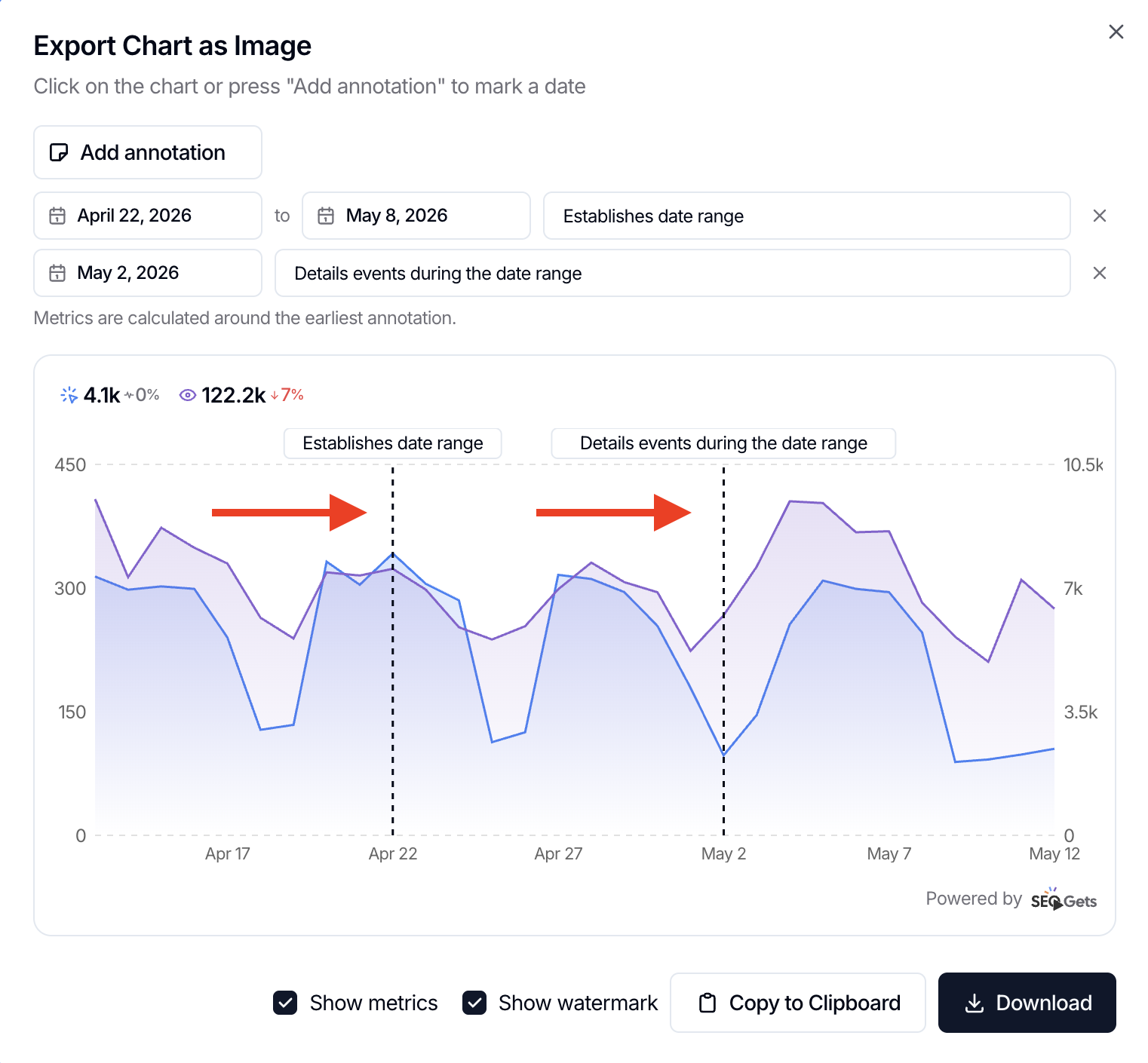
If your view looks different after adding an annotation, check whether:
Your comparison period (YOY vs. Previous Period) changed
Your interval setting (day, week, month) shifted
The URL persisted with different parameters from a previous session
For more on how date ranges and comparisons work, see How to build monthly reports in SEO Gets.
Need true YOY history?
Year-over-year analysis requires enough historical data. Native Google Search Console keeps only 16 months, so true YOY comparison needs extended storage. In SEO Gets, that's a Super Site. See Year-over-year SEO analysis with Google Search Console data for details.